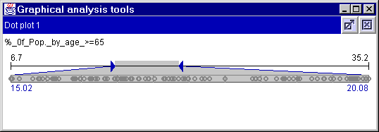
Figure 1
Portugal - Dot plot horizontal - %_of_Pop_by_age_>=65
Noncartographic visualization:
General Information
Dot plot
(horizontal and vertical)
Scatter plot
Scatter plot matrix
Parallel coordinates
plot
Classifier (horizontal and vertical)
Highlighting
The plot is reactive to mouse operations. When the mouse points on some
line or dot, it is highlighted. This gives an opportunity to estimate attribute
values associated with the corresponding object and compare characteristics of
this object to the distribution of characteristics over the whole set of
objects.
Clicking on a line or dot makes it permanently highlighted (until
explicit cancellation). This enables pairwise comparison of the selected object
with other objects. Therefore also point on other objects with the mouse. The
two objects being compared can be well distinguished as permanent and
"mouse-on" types of highlighting differ in color (black and white).
In the
Descartes system a any plot may be dynamically linked to other displays such as
a map or other plots. This means that objects are highlighted simultaneously in
all the displays when one selects them in any of the displays. Due to this one
can explore the set of objects from many perspectives.
Data exploration
often involves tasks of comparison of attribute values for selected objects and
comparison of value ranges of several attributes. Such tasks are usually
relevant to cases when the attributes under investigation are comparable, i.e.
measured in the same units and semantically related. Examples of such data are
land cover or land use statistics, division of population according to age
groups, employment, or marital status, birth and death rates, etc.
The
system allows easily switching between the different variants of scaling of
parallel coordinates.
Some more information on decision support is given on this page.
Dot plot (horizontal and vertical):
One possibility of visualizing attributes is done with dot plots, either horizontal (figure 1) or vertical (figure 2). The plot is a bar with equidistant lines that divides the bar into 10 units. Each value is presented with a little circle. At both ends of the plot the extremal values are indicated in black numbers. The triangle-shaped delimiters on either end of the bar allow the selection of a part of the value range represented by the slider unit. This part can be considered in more detail due to a kind of "zooming" that involves some transformations. The values that don't fit into the selected interval are not shown on the plot. As a result, the dots become less cluttered, the distribution of values within the interval is seen clearer. It becomes easier to focus on the values from the studied interval (see figure 1). Only the horizontal representation indicates the boundaries of the interval (beneath the plot in blue).

Figure 1
Portugal - Dot plot horizontal -
%_of_Pop_by_age_>=65
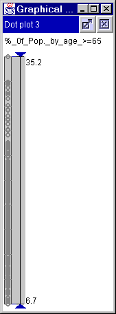
Figure 2
Portugal - Dot plot vertical -
%_of_Pop_by_age_>=65
The scatter plot has a 10x10 grid. Position of a dot on the scatter plot
can be indicated using the X- and Y-coordinates according to the grid, that is,
X and Y can take values form 1 to 10.
Selecting several dots at once can be
done by mouse dragging. It it failed to enclose some of the dots in the
selection frame, in can add them to the selection by clicking on them. Or they
can be deactivated by clicking on them again. All selected dots are deactivated
again by mouse click in an object free part of the scatter plot area or of the
map
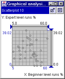
Figure 3
Portugal - Scatter plot
The scatter plot matrix is a square matrix where the names of the attributes are on the diagonal and scatter plots every where else. The axes of the plots are given through the entries in the diagonal. For example in figure 4 the plot on position (row 2, column 1) has "% of Pop by age 15-24" on the horizontal axis and "total employed in Industrie 1991" on the vertical axis. The plots can be manipulated just like normal scatter plots.
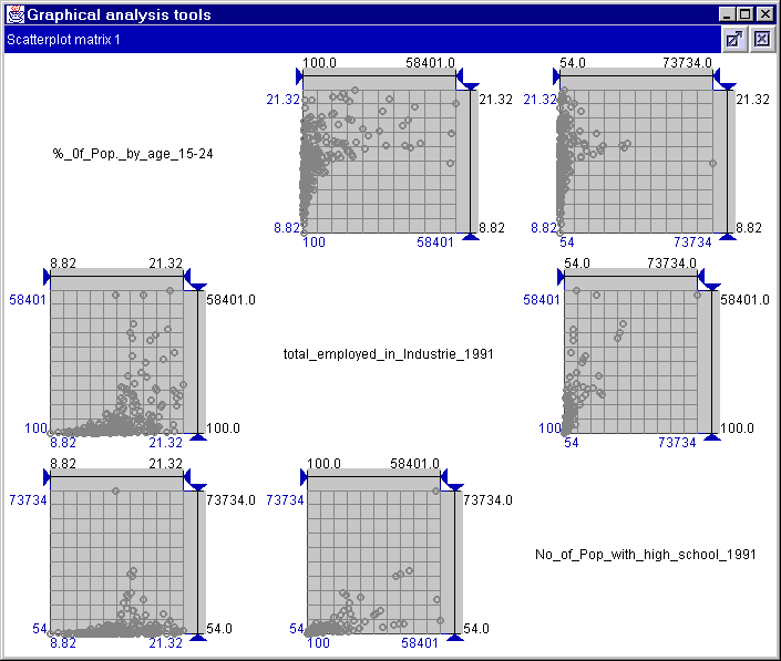
Figure 4
Portugal - Scatter plot matrix
A parallel coordinates plot may have either horizontal or vertical
orientation of the attribute axis. The orientation has no influence on
interpretation of the plot and its use. In this implementation the axes are
horizontal and placed one below another.
In the standard form of parallel
coordinates plot ("Individual Min and Max" is selected as alignment, below the
plot) the leftmost position of each axis corresponds to the minimum value of
the respective attribute, and the rightmost to the maximum value. The leftmost
and the rightmost positions of the axes are aligned (see figure 5).
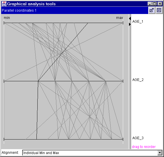
Figure 5
Europe - Parallel coordinates -
Individual Min and Max - Age groups
For the tasks of comparison of values and value ranges the standard form of the plot is inappropriate. The axes need to be scaled so that the same positions correspond to exactly the same number on all the axes. Such scaling is illustrated by figure 6. The plot represents the same data as in figure 5: percentages of people in three age groups (0-14 years, 15-64 years, and 65 and more years) in countries of Europe. It is well visible that the part of the middle-age population is bigger in all countries than parts of other age groups. Such an extreme case was selected in order to demonstrate clearly the difference of the suggested scaling method from the "standard" form of parallel coordinates plot.
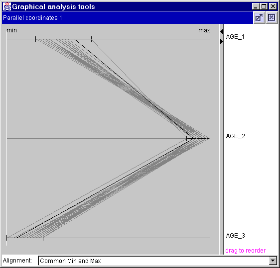
Figure 6
Europe - Parallel coordinates - Common
Min and Max - Age groups
An important activity in exploratory analysis is investigation of
relationships among attributes. It involves comparison of value variation of
different attributes and seeking for correlation between attributes. A parallel
coordinates plot can effectively support these tasks. Thus, if the lines
between two neighboring axes are nearly parallel to each other, the attributes
are positively correlated. If almost all the lines have either north-east to
south-west or north-west to south-east orientation, the attributes are
negatively correlated. Evidently, in order to detect such pairs of correlated
attributes, one can change the order of the attribute axes. It may be also
helpful to "flip" some of the axes.
Another possibility to compare objects
is done by "Selected object(s)" (figure 7). Here the selected object is
centered and the axes are adjusted in scale. When more objects are selected
Descartes calculates the average and uses that.
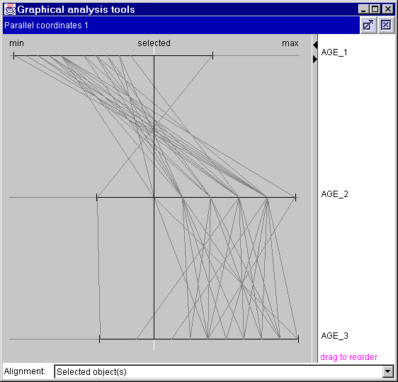
Figure 7
Europe - Parallel coordinates -
Selected object(s) - Age groups
However, the canonical form of parallel coordinates plot may become
inconvenient if the data contain outliers, i.e. values standing far apart from
the bulk of values. Presence of outliers complicates the tasks of detecting
correlated pairs of attributes as well as the tasks of comparison of objects.
For such cases two methods of scaling of the axes are suggested: 1.)
normalization by median and quartiles; 2.) normalization by mean and standard
deviation.
An additional variant of scaling is shown in figure 8. The axes
are positioned so that median values of all attributes are on the same vertical
line and are scaled so that the first and the second quartiles are also
aligned. Positions of the rest of the values are found by linear
interpolation.
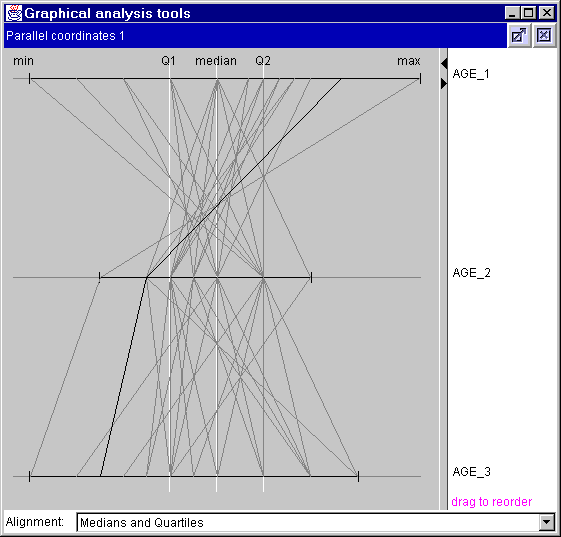
Figure 8
Europe - Parallel coordinates - Medians
and Quartiles - Age groups
In figure 9 the the leftmost and the rightmost positions of the axes are aligned which sometimes may facilitate the comparison of some attributes.
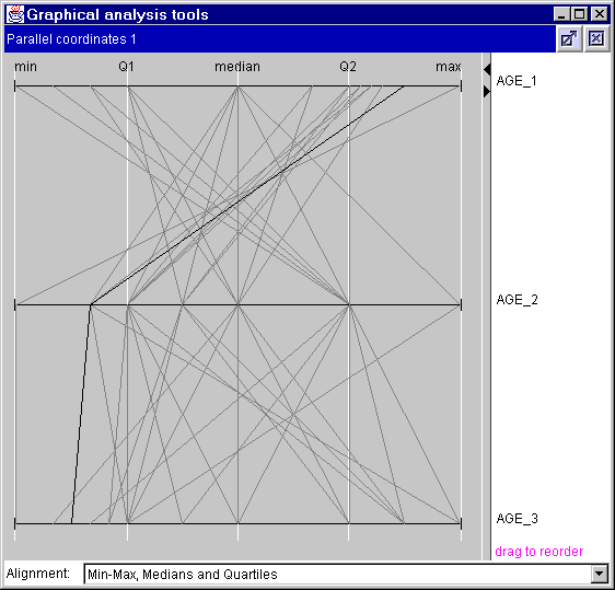
Figure 9
Europe - Parallel coordinates -
Min-Max, Medians and Quartiles - Age groups
In a similar way, in the second variant the values Χ , Χ-σ and Χ+σ are used for axes scaling (here Χ is the arithmetic mean and σ is the standard deviation). This variant is shown in figure 10. Besides neutralizing the impact of outliers, both variant of scaling are good for investigation of general characteristics of value variation.
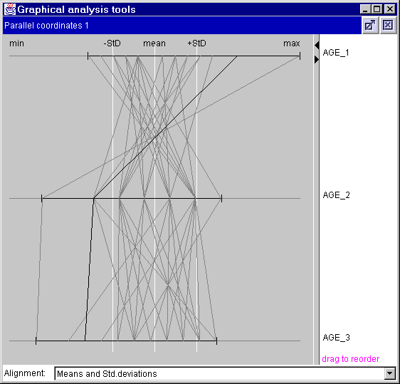
Figure 10
Europe - Parallel coordinates - Means and Std. deviations - Age groups
Figure 11 gives an inconvenient example of Standard deviation...
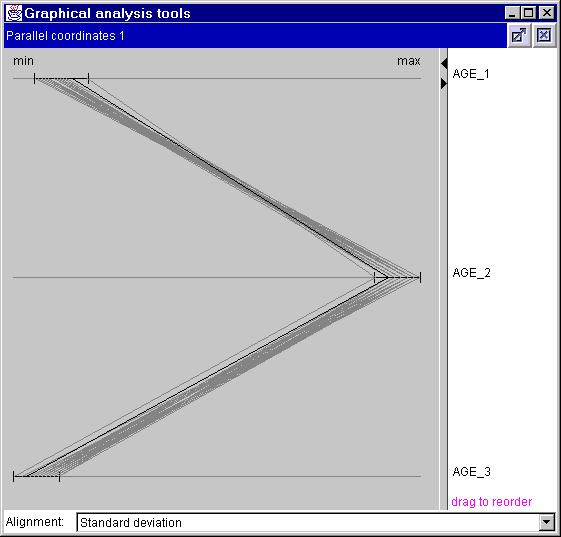
Figure 11
Europe - Parallel coordinates -
Standard deviation - Age groups
Classifier (horizontal and vertical):
Classifier are opened in a separate window showing either a horizontal bar, or a vertical bar. This noncartographic visualization method is used like the classification method described here.