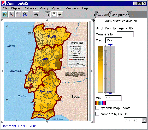
Figure 1
Portugal - Degrees of darkness - %_of_Pop_by_age_>=65
Cartographic visualization methods:
Choropleth maps
Degrees of darkness
Removal of outliers from presentation
Classification
Standalone bars
Color
Parallel bars
Pies
Triangles
Utility
bars
Utility wheels
The "choropleth map" visualization method consists in encoding values of some attribute referring to units of territory division by colors or shades. "Unclassed" means that values of a numeric attribute are converted into degrees of darkness directly, without previous classification: the degrees of darkness are (roughly) proportional to the numbers they represent. A merit of a choropleth map is that it is capable of producing an integral image of the spatial distribution of data, and thus enables the highest, overall level of map reading. Since the whole distribution can be grasped as one image, it is possible to compare two or more distributions presented by choropleth maps. By such comparison one can reveal relationships between several variables: relatedness will manifest itself in similar spatial patterns.
In a so-called unclassed choropleth map values of a numeric attribute are encoded by proportional degrees of darkness: the higher the value, the darker the shade representing it.

Figure 1
Portugal - Degrees of darkness -
%_of_Pop_by_age_>=65
Sometimes in such maps a double sided, or diverging, color scale is used in order to differentiate visually values above and below certain reference value (midpoint): they are represented by shades of two different colors, for example, brown and blue. A special color, for example, white, represents values exactly equal to the reference value. The Descartes system gives the opportunity to change interactively the reference value and to observe immediately how this affects the map. This operation (called "visual comparison") can enhance visibility of spatial patterns, facilitate comparison of entities, and help to locate particular values on the map. This is done by either moving the double ended arrow up and down the colored bar with the mouse (is the check box "dynamic map update" checked, then changes are directly shown in the map), or by clicking on an area that has the reference value (therefor check the check box "compare by click in" and in the text field appearing then, says "this map").
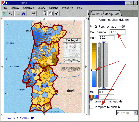
Figure 2
Portugal - Degrees of darkness -
%_of_Pop_by_age_>=65
Observe spatial patterns and trends. Gradually move the "midpoint" through the whole value range of the attribute. Observe changes of the patterns formed by two different colors, regardless of the degrees of darkness. For example, on the figure 2 one can observe how blue shades (corresponding to low values) spread from the areas around the biggest cities of Portugal such as Lisbon and Porto first along the coast and then into the inner parts of the country.
Locate particular values on the map. Just set the value you wish to locate as the value to compare to, and then look for objects on the map painted in white color (see figure 3).
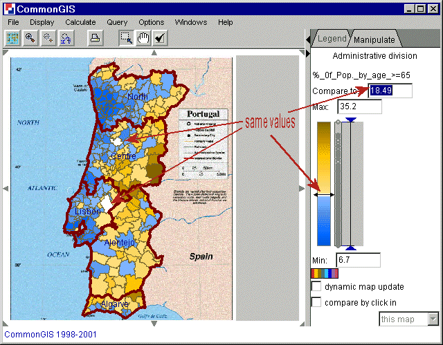
Figure 3
Portugal - Degrees of darkness -
%_of_Pop_by_age_>=65
Compare values referring to different objects. To compare an object with others, for example, with neighbors, click on it in the map. The value associated with this object becomes the reference value. The objects with higher values will be painted into brown, and the objects with lower values in blue. These colors can be changed by clicking on the color scale beneath the text field "Min".
The dot plot shows the distribution of the values. According to the attribute, each dot represents the value of one object. When the mouse touches it, it and all other linked items (map, plots, etc.) are highlighted. The figure 4 gives an explanation of the elements that are shown. The delimiters are used to remove outliers, which is explained in figure 6.
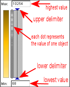
Figure 4
Dot plot explanation
Removal of outliers from presentation:
Very often a data sample under study contains a few very high or very low values of a numeric attribute while the rest values are relatively close to each other. Such values are called outliers. For example, the birth rates in all but one countries of Europe lie between 10.56 and 14.51 births per 10000 population while this single country has 21.70. Maps as well as other graphical displays built to represent such data sets can be insufficiently expressive with regard to the mainstream values, that is, differences between these values can be hardly perceivable from the presentation. Removal of outliers from view gives an opportunity to match expressive means available to a shorter value interval and due to this make the differences among the mainstream values more prominent.
Outlier removal in the Descartes system is done like this: The user needs to drag triangular delimiters (on the right of the map) which are attached to maps and plots when appropriate. Follow the cursor on the figure. The map changes in result of the operation with the upper delimiter. The maximum/minimum value represented before and after the outlier removal changes.
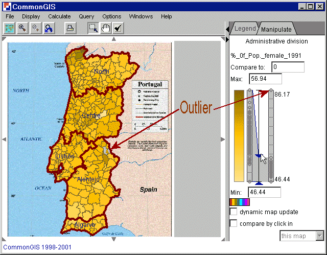
Figure 5
Portugal - Removal of outliers -
%_of_Pop_by_age_>=65
Figure 5 shows the percentage of female population in 1991. There is one outlier with a value of 86.17 (indicated in the map by a grey area with a brown triangle). In the right part of the window two dot plots are displayed. The right one shows the full range of the values and the left one is a sort of zooming (figure 6). It only displays the values in between the delimiters which are also the values used for coloring in the map. Now, after the outlier was removed the value corresponding to the darkest color is 56.94 (shown in the text window titled "Max:").
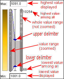
Figure 6
Dot plot explanation
The removal of outliers is also possible in the other visualization methods (standalone bars, bar charts, etc.).
A widely used method for cartographic representation of values of a numeric attribute is classification-based painting. According to this method, the value range of the attribute is divided into intervals that are assigned different colors. Geographical objects are painted in the map according to the intervals into which the corresponding attribute values fit.
The tools include direct manipulation controls for specifying arbitrary class boundaries, graphs representing statistical distribution of attribute values, means for automatic classification, calculation of statistical quality of a classification, and various color schemes that can be applied to represent classes on a choropleth map.
Historically, classification was used in order to minimize the number of
colors needed for representing data values on printed maps. This goal together
with the task of minimizing subjectivity of data representation lead to
development of 3 widely used methods of data classification (figure 7):
1)
classification into equal intervals;
2) classification with equal
frequencies of objects in the classes;
3) statistically optimal
classification.
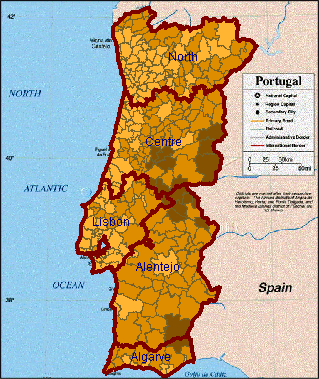
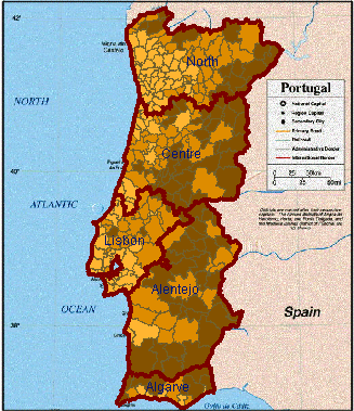
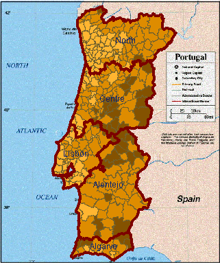
Figure 7
Portugal - Variants of
classification of "%_Of_Pop_by_age_>=65": equal interval classification,
equal frequency classification, and statistically optimal classification
It is well known in cartography that different selection of the number of classes and class breaks can radically change the information perceived from the map. This can be seen, for example, from comparison of the choropleth maps shown in figure 7. These maps result from three variants of classification of Portugal regions into 3 classes according to values of the attribute "%_Of_Pop_by_age_>=65", but it is rather hard to believe that they represent the same data. The effect of classification can be observed by comparing these maps to an unclassed choropleth map representing the same attribute (figure 1).
There are following tools for defining classes:
1) Automatic
classification methods: equal interval classification, equal frequency
classification, and statistically optimal classification. Two ways of using
these methods are possible: the user can either specify the desired number of
classes or the desired quality. In the latter case the number of classes
required will be automatically found by the system. To apply the methods press
"run".
2) A text editing control which lists current values of the breaks.
One can edit the break values, remove breaks, and introduce new breaks within
this control.
3) A compound slider, which visually represents relative
positions of the class breaks between the minimum and the maximum values of the
attribute and displays the currently used color scheme (figure 8). The control
is supplied with a dot plot that represents statistical distribution of the
attribute values.
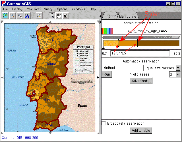
Figure 8
Portugal - Classification -
%_of_Pop_by_age_>=65
The compound slider is a direct manipulation control. One can move any
of slider pointers and in this way update the classification. When a pointer
approaches one of its neighbors, it is removed (i.e. two consecutive classes
are merged). When clicked in a free space between two slider pointers, a new
class break is added that divides the respective class into two classes.
The compound slider has a special function: during the process of movement
of a slider pointer only the objects belonging to the two classes affected by
the corresponding boundary change are shown on the map by painting, while the
remaining objects are shown in neutral gray color. This helps to concentrate
better on the changes of the spatial patterns resulting from the movement of
the boundary.
All figures are immediately updated after any change of the
classes, in particular, during movement of a slider pointer.
In the result of any classification the data loose their precision. The
amount of precision lost (i.e. the statistical error introduced by the
classification) can be measured. The total error of a classification is
calculated as a sum of internal errors for each individual class, E=ΣEk.
The internal class error Ek is calculated depending on the chosen measure of
diversity. We introduce 3 measures of diversity named "mean measure", "median
measure", and "entropy measure":
The first measure is calculated as a
squared deviation from the class mean: Ek= Σ(Xi-Xk)^2, where
Xk is the class mean. The second
measure is calculated as a sum of absolute deviations from the class median,
Ek=Σabs(Xi-Xk), whereXk is the class median. This measure
is less affected by extremes in the tails of the distribution (outliers) than
the first measure because the data in the tails have less influence on the
median than on the mean. The third measure aggregates deviations from the mean
using logarithm function conventional in information theoretic approaches,
Ek=Σabs(Xi-Xk)log(abs( Xi-Xk+1)). If the deviation is small the
function increases approximately as the mean squared deviation (the first
measure) while for large deviations it grows much slower, so that outliers make
less contribution into the total error.
For each classification produced by the system or modified by the user
we compute 2 indicators of the quality. The first represents the loss of
precision in the result of the classification. The second is a ratio of the
first value to the value for the statistically optimal classification with the
same number of classes. Hence, the first indicator expresses how far the
classification is from the original data set, and the second one - how far it
is from the optimal classification. In order to find the optimal
classification, an algorithm is used, that has a special iterative organization
when classifications obtained on earlier steps are efficiently used on the next
steps.
Both quality indicators are presented as numbers measured in the
scale 0% to 100% as well as graphically (see figure 9). The indicators are
automatically updated after each change of the classes.
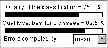
Figure 9
Representation of the statistical
quality of a classification
In classification of spatially referenced data an analyst needs to consider the data from two perspectives, statistical and spatial, and take into account the peculiarities of both the statistical and the spatial distributions of the data. This means that the analyst needs to pursue at least two concurrent goals. The first is to minimize variation of data within each class and to maximize differences between classes. The second goal is to divide the territory into the smallest possible number of coherent regions with low data variation within the regions. The analyst needs such tools that would allow her/him to balance between these goals in search of an acceptable compromise solution. Whereas the statistically optimal classification algorithm is suited to the first goal, it does not take into account the spatial aspect of the data and, hence, cannot help in approaching the second goal. Therefore so important is the "freehand" classification procedure described above: class breaks can be moved and immediately the changes of the patterns are observed on a map. A visual representation of the statistical value distribution can help the analyst to meet also the statistical criteria in the course of interactive classification. The dot plot accompanying the compound slider could be suitable for these purposes, but overlapping of point symbols in it obscures understanding of the distribution.
One more method for graphical representation of statistical distribution is the cumulative frequency curve, or ogive. In such a graph the horizontal axis represents the value range of an attribute. The vertical position of each point of the curve corresponds to the number of objects with values of the attribute being less than or equal to the value represented by the horizontal position of this point. Peculiarities of value distribution can be perceived from the shape of the ogive. Steep segments correspond to clusters of close values. The height of such a segment shows the number of the close values. Horizontal segments correspond to "natural breaks" in the sequence of values.
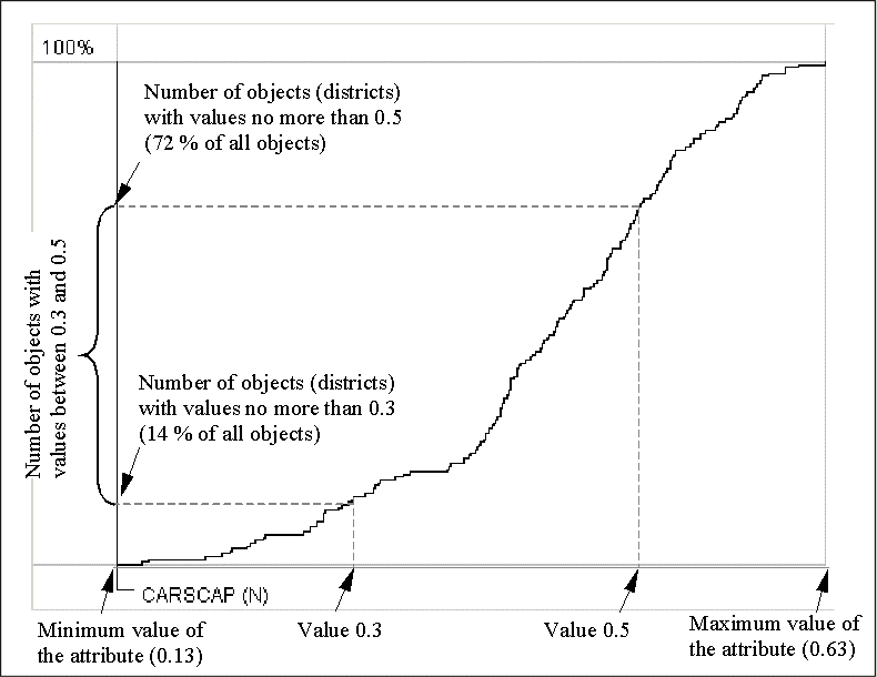
Figure 10
Cumulative frequency
curve
It is important that the cumulative frequency curve does not require prior classification. However it can represent results of classification by means of additional graphical elements. Thus, the horizontal axis of the graph may be suited to show class breaks. For this purpose Descartes uses segmented bars with segments representing the classification intervals. The segments are painted in the colors of the classes. The positions of the breaks are projected onto the curve, and the corresponding points of the curve are, in their turn, projected onto the vertical axis. The division of the vertical axis is also shown with the use of colored segmented bars. The lengths of the segments are proportional to the numbers of objects in the corresponding classes. With such a construction it becomes easy to compare the sizes of the classes. For example, the class breaks shown in figure 11 divide the whole set of objects into 3 groups of approximately equal size that is demonstrated by the equal lengths of the bar segments on the vertical axis.
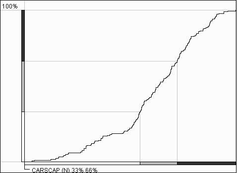
Figure 11
Classes on a cumulative
frequency curve
The use of the map and the cumulative frequency graph within the tool for classification allows the user to balance between the statistical and geographical criteria. For example, after looking at the graph shown in figure 11 one may wish to move the lower break from the area of clustering (indicated by a steep segment of the curve) to the horizontal segment on the left of it. This operation will improve the classification from the statistical perspective. At the same time one can see how this affects the pattern visible on the map. When there is a break on a gentle slope, it may be reasonable to try to swing it around this position in search of a simpler spatial pattern. It is also possible to focus during break movement on the vertical axis of the graph and produce classes with desired relative sizes (numbers of objects).
In particular application domains additional classification criteria may come into play in combination with the statistical and geographical ones. For example, in demographic analyses it may be important to produce classes of districts that do not differ too much in total number of population that lives in them.
It is possible to generalize the idea of the cumulative frequency curve and to build similar graphs summarizing values of arbitrary quantitative attributes. Examples of such attributes are area, population number, gross domestic product, number of households, etc. A generalized cumulative curve is built in the following way. Let the horizontal axis correspond to attribute A and the vertical to attribute B. The curve matches each value x of A with the sum of values of B computed for objects with the values of A being less than or equal to x. So, the maximum value of A will correspond to the total sum of values of B for all the objects of the sample. Let, for example, the districts of Leicestershire be classified according to the number of cars per capita, and a generalized cumulative curve represent the attribute "Total population". Then the vertical position corresponding to x cars per capita would reflect the total number of population living in districts with no more than x cars per capita.
The classification tool of Descartes allows to add a generalized curve for any quantitative attribute to the cumulative frequency curve display. The curves are overlaid, i.e. drawn in the same panel (see figure 12). To be better discriminated, the curves differ in color. The horizontal axis is common for all of them. The vertical axes are shown beside each other on the left of the graph. Each of the vertical axes is divided into the same number of segments, but positions of the breaks are, in general, different. This is clearly demonstrated in figure 12. It shows that 34% of all districts fit in the lower class of the classification. They occupy only 10% of the total area but contain 50% of total population.
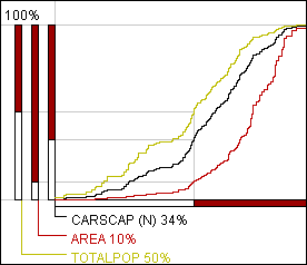
Figure 12
Generalized cumulative
curves are built for the attributes "Area" and "Total population". The
classification is done on the basis of the attribute "Number of cars per
capita".
Having such a tool, it is easy to account in classification for such criteria as even distribution of population among the classes, or approximately equal total areas occupied by the classes, or other specific criteria that may emerge in this or that application domain. Thus, to make classes approximately equal in total population, the analyst should focus in the process of slider movement on the axis corresponding to total population and try to position the sliders so that the axis is divided into segments of equal length.
Besides this opportunity, generalized cumulative curves may be used for exploring relationships between various characteristics of the classified objects. Let us demonstrate this on the example of exploration of unemployment in Leicestershire. We used the attributes "Number of unemployed" and "Total population" to calculate percentage of unemployed in total population in each district. Then we took this new attribute as the basis for classification. The classification tool showed us that proportion of unemployed in population varies from 0.9% to 13.62%. We considered values above 4% to be very high and wondered in how many districts this threshold is exceeded and where these districts are located. We entered 4 as a class break and in this way divided all districts into two classes: with up to 4% of unemployed persons in population and with more than 4%. The cumulative curve display showed us that only 18% of all districts fit in the upper class (figure 13). The map shows a vivid spatial cluster of such districts in the centre of the area. It is seen that these districts occupy a rather small part of the whole area. However, when we selected the attribute "Total population" for representation on the cumulative curve display, we found that the districts with high unemployment contain 33% of the total population of Leicestershire.
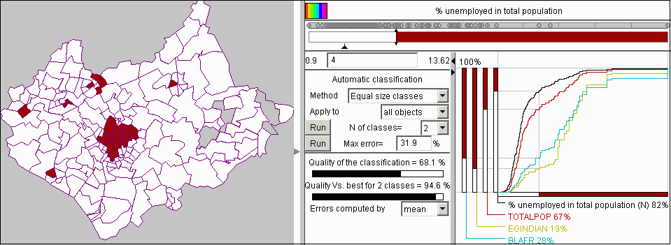
Figure 13
The use of generalized
cumulative curves for exploration of unemployment in Leicestershire
We became interested whether there is a link between unemployment and distribution of national minorities. We added to the cumulative curve display the attribute BLAFR representing total numbers of people originating from Africa by districts. In figure 13 it is vividly seen that the curve for this population group radically differs from that for the whole population. It is also seen that the axis corresponding to this attribute is divided in quite a different proportion than those for the frequency and for the whole population. Only 28% of people with African origin live in districts with lower unemployment and, hence, 72% live in districts with more than 4% unemployed in total population. The difference is even more dramatic for people originating from India (represented by the attribute EGINDIAN). One can see that 81% of these people live in the areas with high unemployment.
We continued our investigation of unemployment by moving the class break so that the population was divided into two equal parts. Figure 14 shows the result of this operation. The new value of the class break is 2.89. This means that 50% of total population lives in districts with more than 2.89% of unemployed. These districts, as it is seen from the map, constitute a rather small part of the whole territory of the county. Hence, the population density in them is higher than in the rest of the districts. Apparently, these are mainly urban districts. The map shows also that the districts with higher unemployment are spatially clustered. The national minorities considered above are now distributed between the classes of districts in the following way: only 14% of Indians and 18% of Africans live in the districts with lower unemployment, and, hence, 86% and 82%, respectively, live in the areas with more than 2.89% unemployed in population.
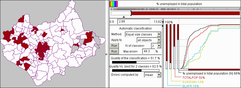
Figure 14
The cumulative curve
display was used to divide the districts into two classes with equal total
population.
This example analysis demonstrates that generalized cumulative curves can not only facilitate classification with multiple criteria involved but also to reveal significant relationships in data. However, it should be borne in mind that this technique is suitable only for attributes the values of which can be summed up over the set of objects they refer to. For example, it would be wrong to apply it to percentages, averaged values, rates, values per capita etc.
Within the system several graphical displays may be simultaneously present on the screen. Besides maps, these may be dot plots, scatter plots, and parallel coordinate plots. The displays can represent different attributes of the same objects or the same attributes in different ways or combinations. Having a classification, it is possible to propagate class colors to other displays. As a result, points on a dot plot or on a scatter-plot and lines on a parallel coordinates plot will be painted in the colors of the classes the respective objects fit in. This feature, known as "brushing", is very useful for studying relationships between attributes. Check "broadcast classification" to activate this.
The small triangle (pointer) between the slider band and the text field indicates a reference class. Members of this class appear in white. Those below this reference class are e.g. in shades of blue and those above are e.g. in shades of red. The reference class can also be changed by dragging the pointer.
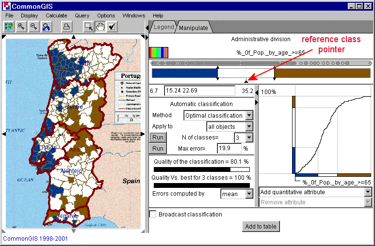
Figure 15
Portugal - Classification -
%_of_Pop_by_age_>=65
Once a desired classification is obtained it can be added as a new attribute to the layer (table). Each object is assigned with a number that corresponds with the class it is in. To this new attribute on the other hand different tools can be applied.
With this tool each value of an attribute is displayed by a single bar with a height proportional to the value. The color can be changed by clicking on the cube left of the attributes name. Also standalone bars can be manipulated to compare by values or by clicking on the map (check the check box "compare by click in"). To compare by values move the double sided arrow on the left side of the bars up or down or enter a value in the text box "Compare to". Positive values are shown above the line and negative below it in the same color. (Figure 16)
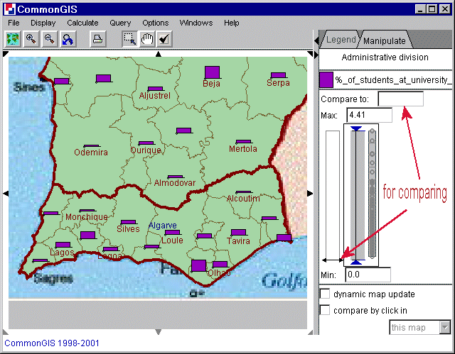
Figure 16
Portugal, south - Standalone bars - %_of
_students_at_university_1991
Sometimes an attributes does not exist of numeric values and no ordering is possible. Then each value can be depict in a different color. These colors can be changed by clicking on the colored box next to the value names. Is the little check box not checked, then this value is not shown in the map (dark grey objects). In figure 17 the different religions in Europe are represented and "Lutheran" is not active (see Iceland, Norway, Denmark, etc.).
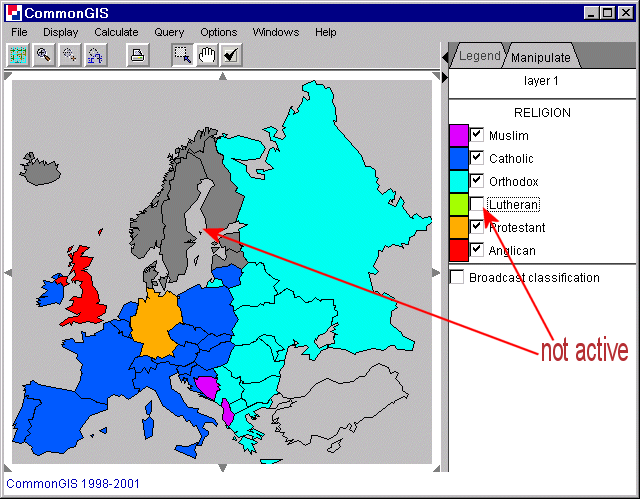
Figure 17
Europe - Color - Religion
With this comparison method the selected attributes are displayed in bars next to each other. It is not possible to stress one or more attributes like working with other methods such as the utility bars (explained here). In the manipulation area a multiple dot plot is shown. Each attribute has its own vertical plot. The value range is valid for all attributes and starts at zero by default but can be changed by dragging the lower delimiter upwards or changing the value in the textbox titeled "Min". The hight of the bars correspond proportionally to the maximum height of the bars, the value range and the value itself. Changing the color or comparing with specified values is done as in the other methods.
When attributes can be added to make some meaningful summary pie charts are good for seeing proportions. For example all age groups sum up to the whole population of each area.
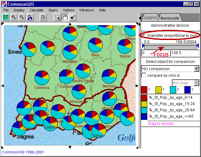
Figure 18
Portugal - utility wheels -Age
The order of the attributes can be changed by dragging them to the wished position. A little green arrow shows where it will be placed after letting go. The colors can be changed by clicking on the colored boxes next to the attributes name. To display the diameter of the circles proportionally to the sum just check the check box "Diameter proportional to sum". Underneath this box is a bar that focuses. It removes large pies and makes small ones lager and better visible. This action makes sense, when the diameter is proportional to the sum.
Two selected attributes can be visualized by triangles. What axis belonging to which attribute is shown in the middle part of the legend by small double arrows. Using figure 19 as an example one can see that: vertical (up-down): Beginner level runs in %; horizontal (left-right): Price for ski pass (6 days). The numbers shown next to the triangles are the extreme values of each attribute. To the right are the ones for the vertical attribute and underneath are the ones for the horizontal attribute. The four triangles displayed show the extreme shape a triangle can take: upper left: max of Beginner runs and min of Price; lower left: min of both attributes; upper right: max of both attributes; lower right: min of Beginner runs and max of Price. For somebody who goes skiing for the first time a triangle of the shape tall and thin is wished. S/he would probably choose La Forclaz (black circle at mouse pointer).
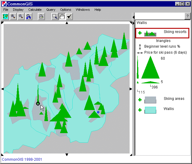
Figure 19
Wallis - Triangles
The settings of the triangles can also be changed. Double click on the triangle in the legend. Then the color, the minimum height and width and the maximum height and width can be set.
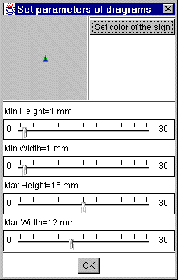
Figure 20
Triangle settings
The visualization of utility bars are similar to standalone bars only more attributes can be added easily with the text fields on the bottom right. Different attributes are displayed in different colors that can be changed by clicking on the colored box next to the attributes name. Comparing the objects by the value of one selected object can be done by "compare by click in" or by selecting an object from the object list (upper right). Different weights can be applied to different attributes to emphasize them by moving the slider in the bar beneath the name of the attribute. The current weight value is displayed to the right of it. The button "Set equal weights" gives all attributes the same weights. The arrow left of the attributes name specifies whether the attribute is to be maximized or minimized. Is it pointing to the upper right it stands for maximizing (benefit, higher values are better) and when it points to the lower right it stands for minimizing (costs, smaller values are better). Depending on the weight and on the optimization direction (min or max), Descartes determines the results by integrating over the area of the frame and sorts them by percentage value. In the grey bar above the weight settings one can determine which utility bars are to be shown on the map (the grey shaded ones, also indicated above the bar). More about comparing attributes is explained in decision support.
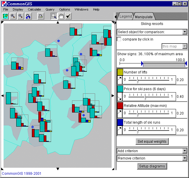
Figure 21
Wallis - utility bars
To change the parameters of the diagrams click the button "Setup diagrams" (see figure 22). Here the maximum height and width can be adjusted. A frame, a thin line around the maximal values, can be set. And the order of segments can be prescribed: preserved: keeps order of attributes, descending: sorts by decrease of height and ascending: sorts by increase of height.
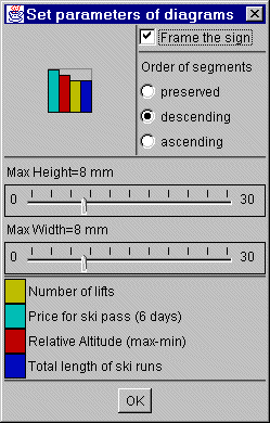
Figure 22
Utility bar settings
Utility wheels are just like the utility bars. The manipulation is just the same, but except for bars, wheels are displayed on the map. The radius of the wheel corresponds to the height of the utility bars and the angle to the width.