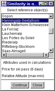
Figure 1
Selection of reference object(s)
Calculation as Multivariable analysis
Similarity (distance)
Similarity
(classification)
Dominant attribute
classification
An interesting and useful kind of data analysis can be done on the base
of calculation of the degree of similarity, or of the distance between objects
in the multidimensional attribute space. Analysis of similarity can help
understand the distribution of characteristics over a set of objects.
The
referenz object(s) are selected out of a list of all objects (figure 1). It is
also possible to select them by mouse click on the map when the corresponding
layer is active (red box in the maplegend).

Figure 1
Selection of reference
object(s)
Descartes has several methods of calculation of distance between objects
implemented based on various types of metrics . The results of calculation can
be illustrated on a parallel coordinates plot containing, besides axes for the
source attributes, an axis with the distance (Figure 2). One can easily find
the line representing the reference object and compare it with the lines of
other objects. One possibility is to mark this particular line on the plot with
transient or durable highlighting. Another possibility is to transform the plot
so that the reference line becomes straight.
In the latter case all axes are
shifted without changing their scales. This representation method helps to
understand and verify the results of distance calculation. The closer a line is
to the straight reference line, the similar it is to the reference object. The
user has an opportunity to tune the method of calculation by setting up its
parameters including the metrics to be used. Any change of the parameters
immediately results in change of the appearance of the plot.
The different available metrices are:
L1:
Dist(A,B)=Sum(Abs(Ai-Bi))
L2: Dist(A,B)=Sqrt(Sum(Ai-Bi)^2))
C:
Dist(A,B)=Max(Abs(Ai-Bi))
T: Special metric for time series data. It
reflects number of time moments with similar change of values. Do not use with
non-temporal data!
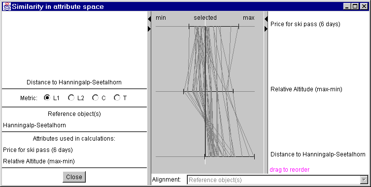
Figure 2
Parallel coordinate plot for similarity
measured with distance
The map window also changes. The objects (in figure 3: the skiing resorts) are colored in degrees of darkness (description see here).
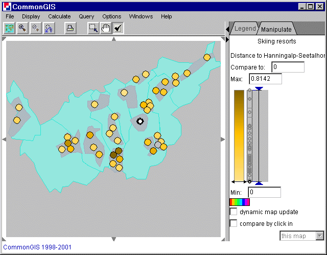
Figure 3
Visualization of
similarities measured with distance
On the basis of calculation of distances one may do another exploratory
data analysis task: classify objects into two classes represented by their
samples.
The procedure of classification is done in the following
way:
For each object the system computes distances DI and DII to the given
samples of the classes I and II. If for some object min(DI,DII)>d0 where d0
is some specified threshold, this object is not ascribed to any of the classes
(it is too different from both samples). Otherwise, the object is included in
the class I if DI<DII or to the class II if DI>DII. The user can select
different metrics for computing distances as well as vary values of the
parameters. To change d0 move the slider in "distance threshold for
classification". The current value can be read off at the right of the
scale.
The task of similarity-based classification may be also supported
with a parallel coordinates plot. The plot contains axes for all source
attributes, the distances to the classes I and II, and the results of
classification. The latter are encoded by numbers: -1 stands for class I and 1
for class II, and 0 for non-classified objects. The aces are transformed so
that the lines for the two samples are straight (this is possible only if
values of all attributes for these two objects are different). The scale of
each axis is determined by the difference between the values of the attribute
for sample I and sample II. The orientation of an axis may change to
right-to-left in order to make the value for sample I be located on the left of
that for sample II. The appearance of the plot is shown in figure 4.
The so
transformed plot illustrates well the results of the classification. If some
line lies close to the line of one of the samples, the corresponding object
belongs to the class the sample represents. If some line differs very much form
the lines of both samples, the object remains unclassified.
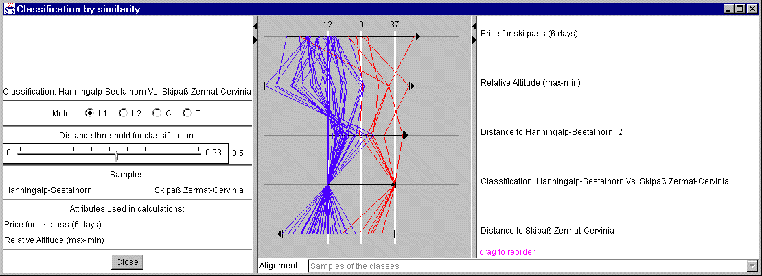
Figure 4
Parallel coordinate plot for classified
similarity
In a case of analysis of geographically referenced data the results of
classification are also represented on a map (see figure 5). The objects are
painted in different colors depending on whether they belong to class I,. class
II, or are unclassified.
The lines in the figure are colored in blue and
red, because the check box "Broadcast classification" is checked in the map
window (figure 5).
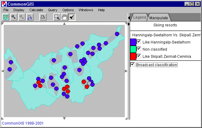
Figure 5
Visualization of classified
similarities
Dominant attribute classification
This method gives the dominant selected criteria of every object depending on the minimum or maximum (can be changed in the parallel coordinate window, figure 6).
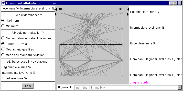
Figure 6
Parallel coordinate plot for dominant
attribute calculation
The look of the plot can be changed by normalization:
| No normalization (absolute values) | Attributes are presented on a single scale of their absolute values without any normalization |
| 0 (min) ... 1 (max) | Attributes are normalized onto a scale from 0.0 to 1.0 such that 0.0 corresponds to the minimum value and 1.0 corresponds to the maximum of each attribute |
| Median and quartiles | Attributes are presented on a scale with the medial values of each attribute aligned in the centre and the quartiles also aligned |
| Mean and standard deviation | Attributes are presented on a scale with the mean values of each attribute aligned in the centre and the means +/-1 standard deviation also aligned |
For each object the dominant attribute is displayed by a certain color. The colors can be changed by clicking on the colored box in the manipulation tag (right). And the check boxes next to them can turn this attribute on and off (affects all windows).
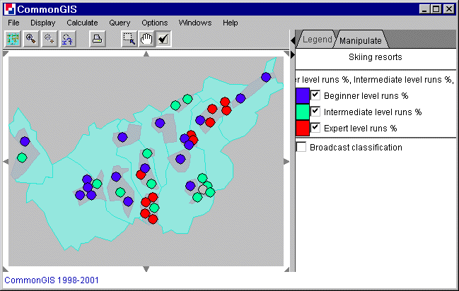
Figure 7
Visualization of the dominant attribute
calculation
When the check box "Broadcast classification" is checked, then all dots and all lines in all charts have the same color as those on this map.