Figure 1
Parallel coordinate plot for decision support
Calculation as Decision support
Integrated criterion
Values ->
Order
See also decision support.
One more application of parallel coordinates plot is evaluation of
objects on the basis of multiple criteria. There exist a number of
computational methods to support this activity. In one of them relative
importance of the criteria is expressed by assigning weights to them. Then an
integrated score is computed for each object as the weighted average value of
its performance according to each criterion. Two types of criteria need to be
distinguished: benefit criteria (bigger values are better) and cost criteria
(smaller values are better).
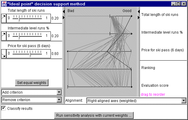
Results of evaluation can be explored using a
parallel coordinates plot with axes for all criteria and for the integrated
scores (see figure 1). Axes for benefit criteria are oriented from left to
right, and axes for cost criteria have the opposite direction. Lengths of the
axes may be (optionally) made proportional to weights of the criteria.
Such
a display significantly helps in understanding and verification of results of
the automatic evaluation. According to the construction of the plot, the more
to the right a line lies, the better is the object it represents. The
corresponding position on the final score axis will also be closer to the right
end of the axis.
The visualization allows interactive analysis of
sensitivity of the final scores to changes of the weights. When any of the
weights are changed, the scores are immediately recomputed, and the results are
reflected in the plot.

Figure 1
Parallel coordinate plot for decision
support
The plot may be linked to a map showing locations of the objects. In figure 2 the plot is linked to a map representing the integrated scores of the options by degrees of darkness. The line and contours of the best option is highlighted in the plot and in the map. The map may represent the final scores, for example by painting, and change them in parallel with changes in the plot.
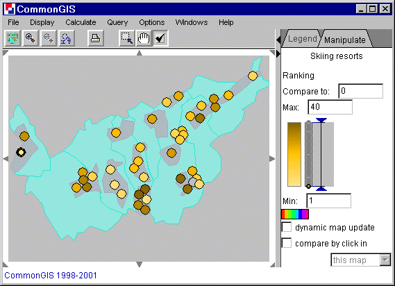
Figure 2
Visualization for decision support in
degrees of darkness according to the ranking
The check box "classify results" in the lower left corner of the plot window represents ranking on the map by means of classification (see figure 3). Classification is explained here.
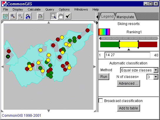
Figure 3
Visualization of classified
decision support
With this calculation method all values of the selected attribute is ordered. A ranking of the objects is visualized in the map by degrees of darkness (see figure 4).
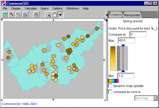
Figure 4
Visualization of ordered values by degrees of
darkness
Another example is the birth rate (permille) in the provinces of Portugal. Figure 5 shows the values of each province:
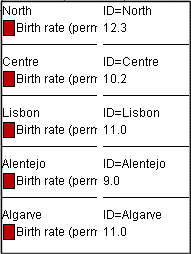
Figure 5
Portugal - Values of birth rate (permille) in the
provinces
A new attribute (ranking of the objects) is created (a new column is added to the table) and displayed in degree of darkness on the map as shown in figure 6.
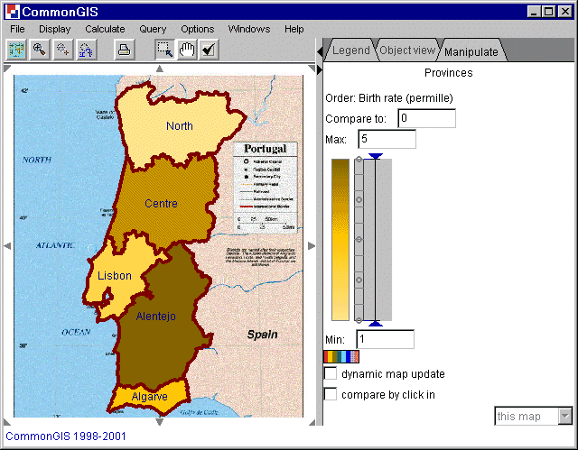
Figure 6
Portugal - Order of birth rate (permille)